Work for Schafer Condon Carter, a traditional print advertising agency in Chicago, with notable clients including The Chicago Cubs. Like many other agencies right now, the digital side of things are becoming a greater ask in the world of advertising. I was brought on to help support that need and growth for the agency. Primarily tasked to redesign and re-think a large online storage facility rental website, that allows a user to rent storage units online, in a simple and convenient secure online process. First for the industry in the ever evolving world of personal storage solutions.
Thinking mobile first with transactions in mind.
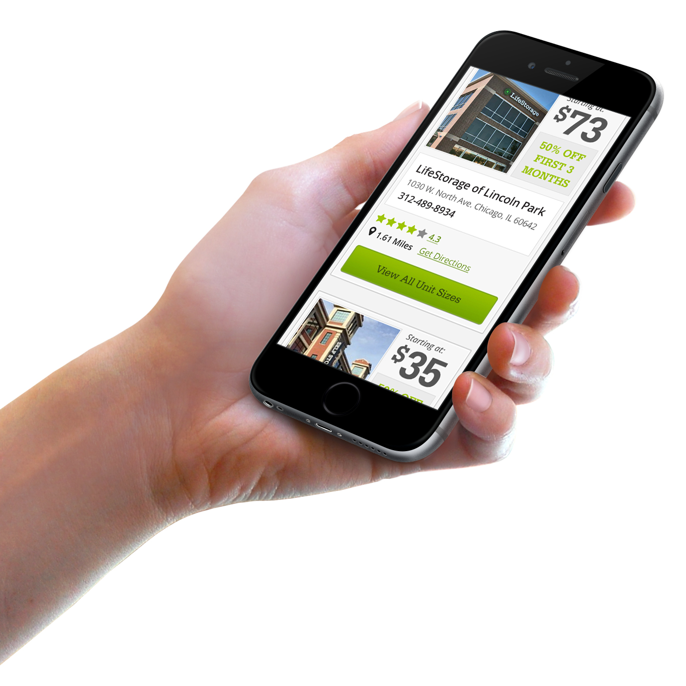
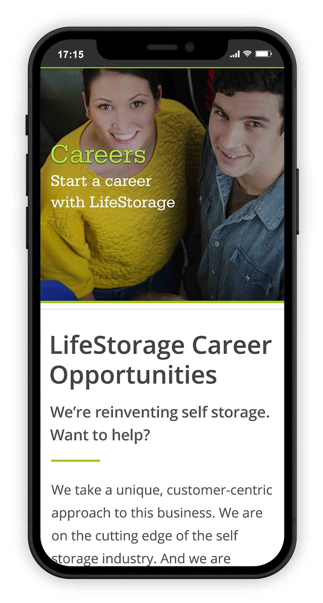
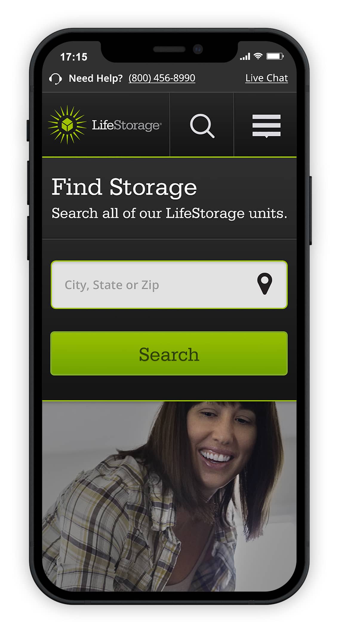
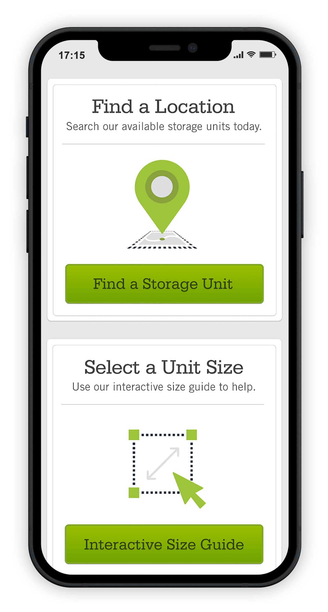
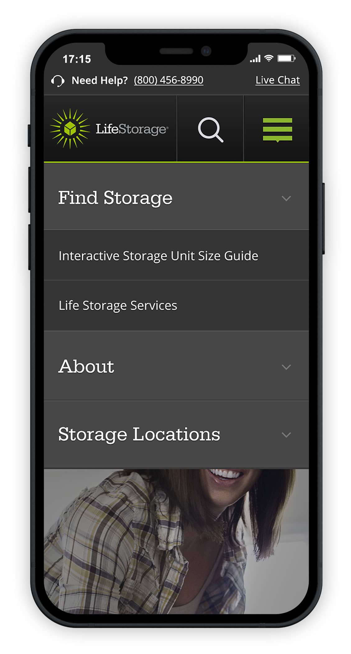
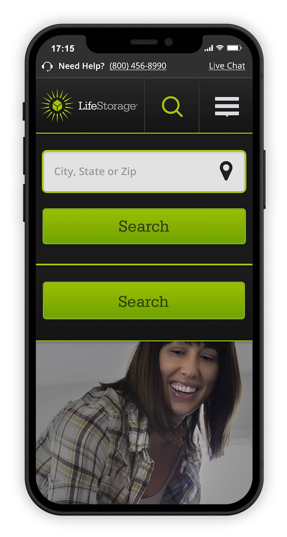
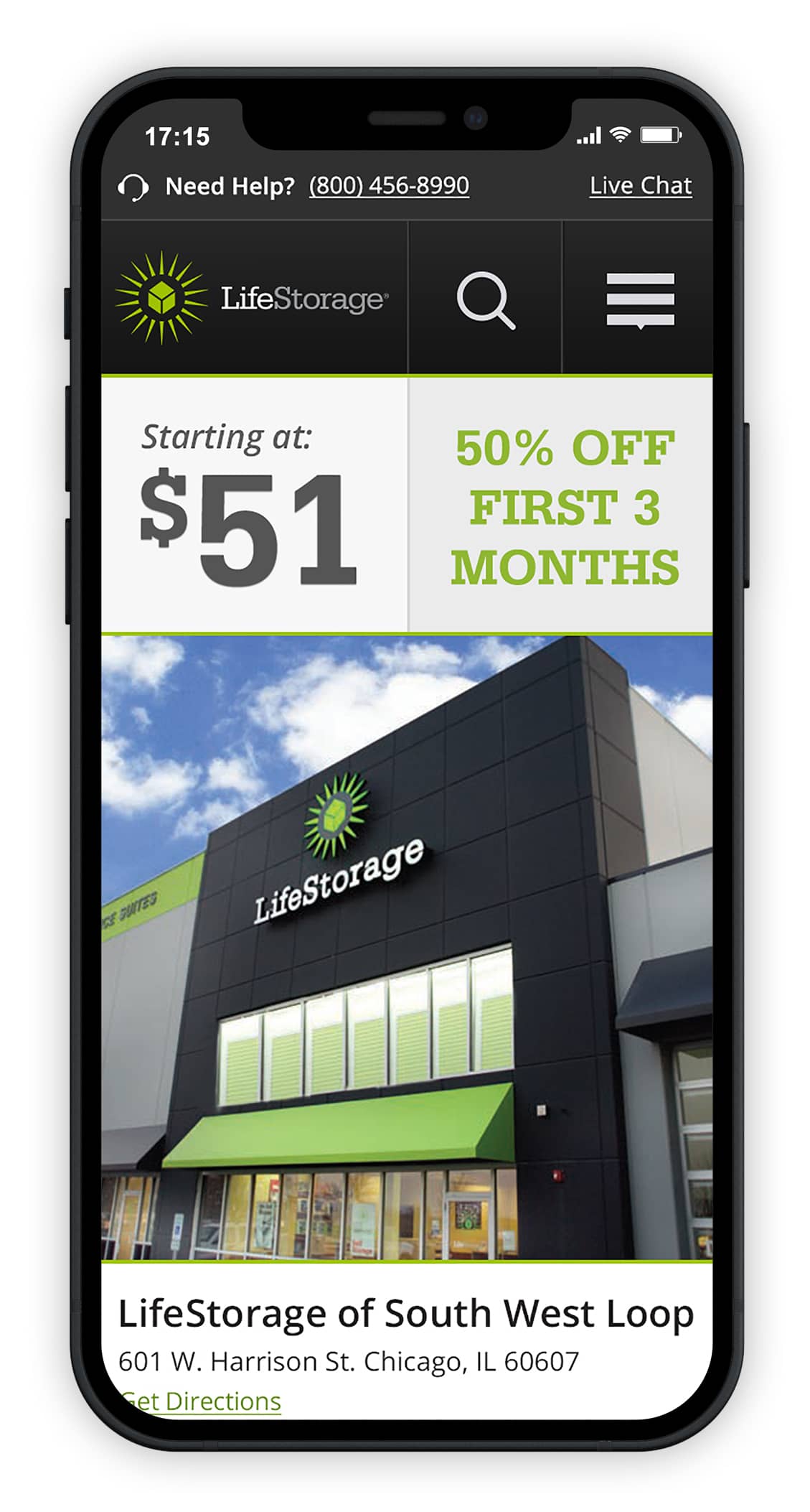
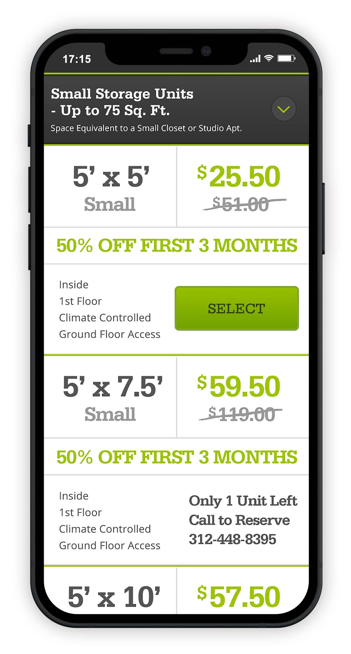
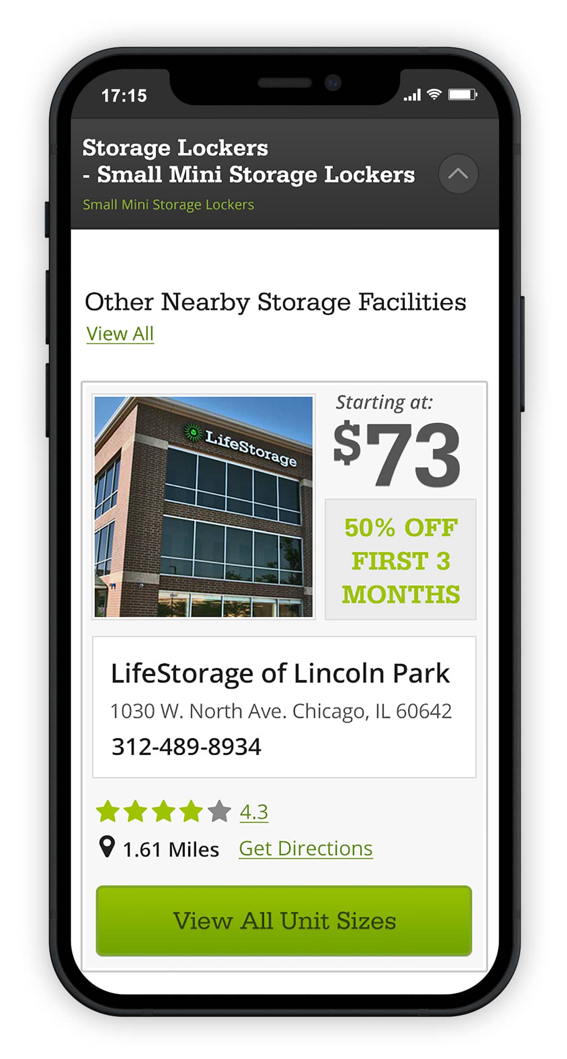
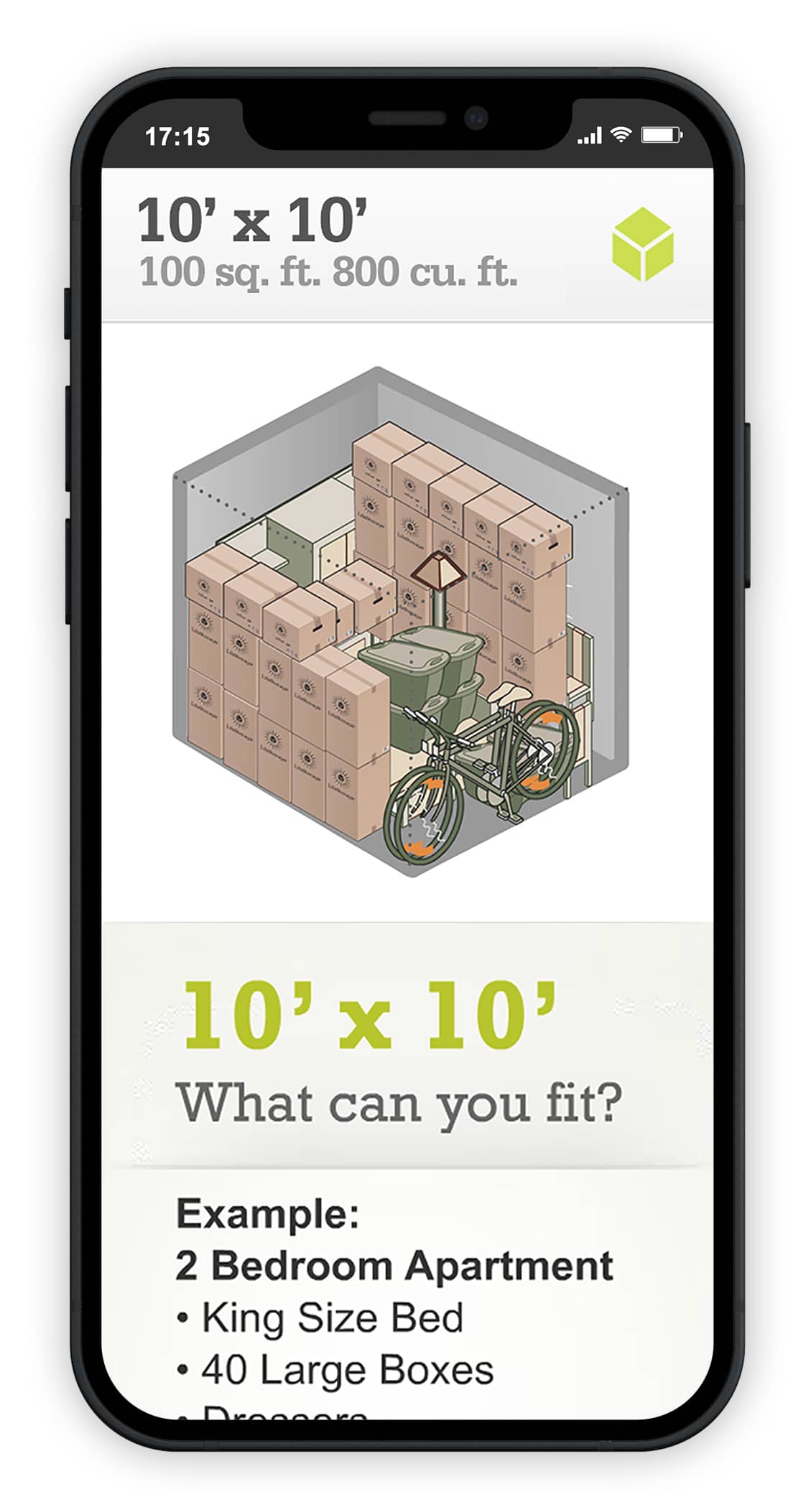
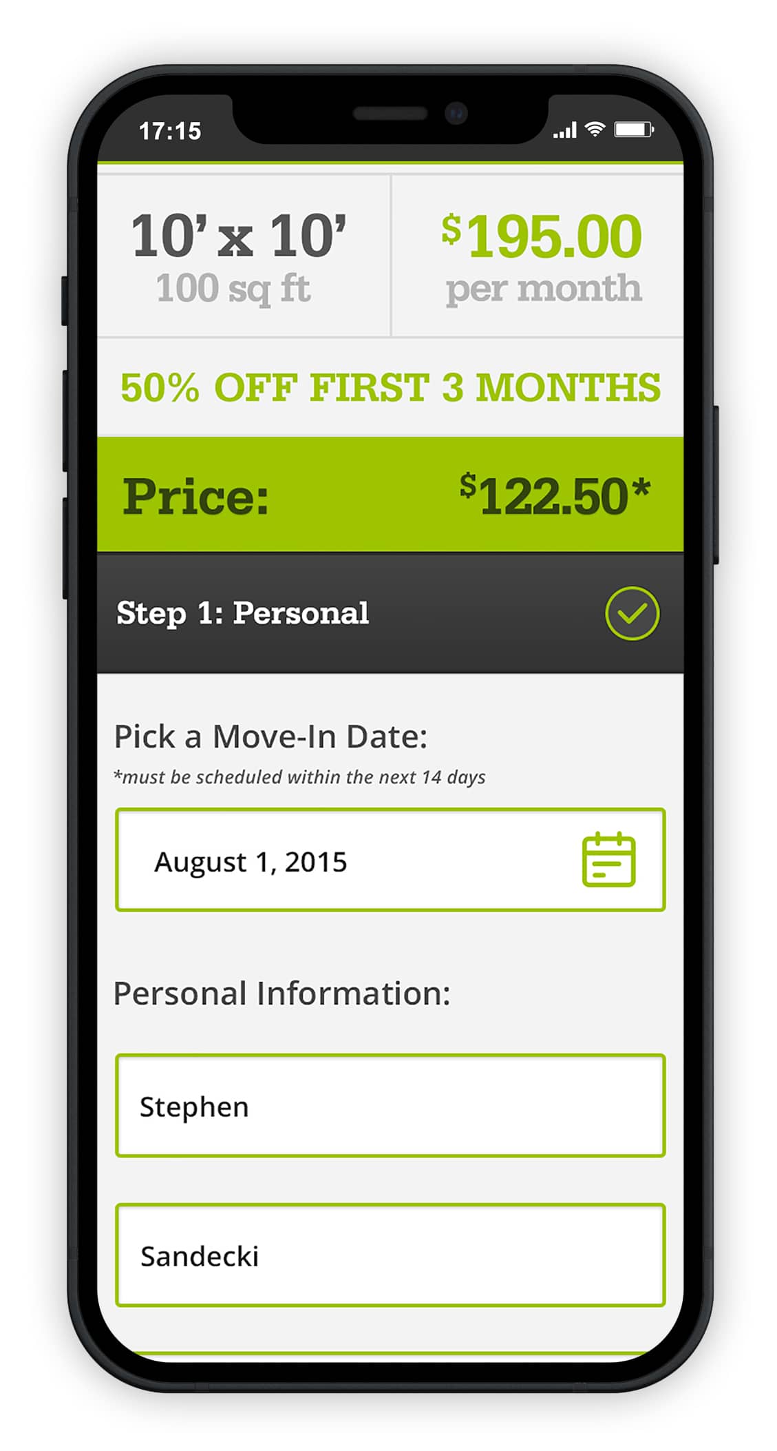
Responsive design was a first thought in this project. The client was updating their outdated and poorly designed website, and wanted to ensure that users would be able to use the site on their respective mobile devices. This was completed, by producing wireframes both for the desktop experience as well as the mobile experience separately to really understand how the site would break down.
Making it easy for the end user
The approach to this website redesign was to keep everything relatively traditional and simple in mind. The client requested that we eliminate “thrills and Frills” when possible, as they were concerned that those type of items would only get in the way of a users online storage rental experience. I did this by keep things clean and easy to digest to the user, and had to keep in mind all the working elements that would be reused over and over through the entire site. Promotional pieces and other items were designed as templates to make the build an easier overall.
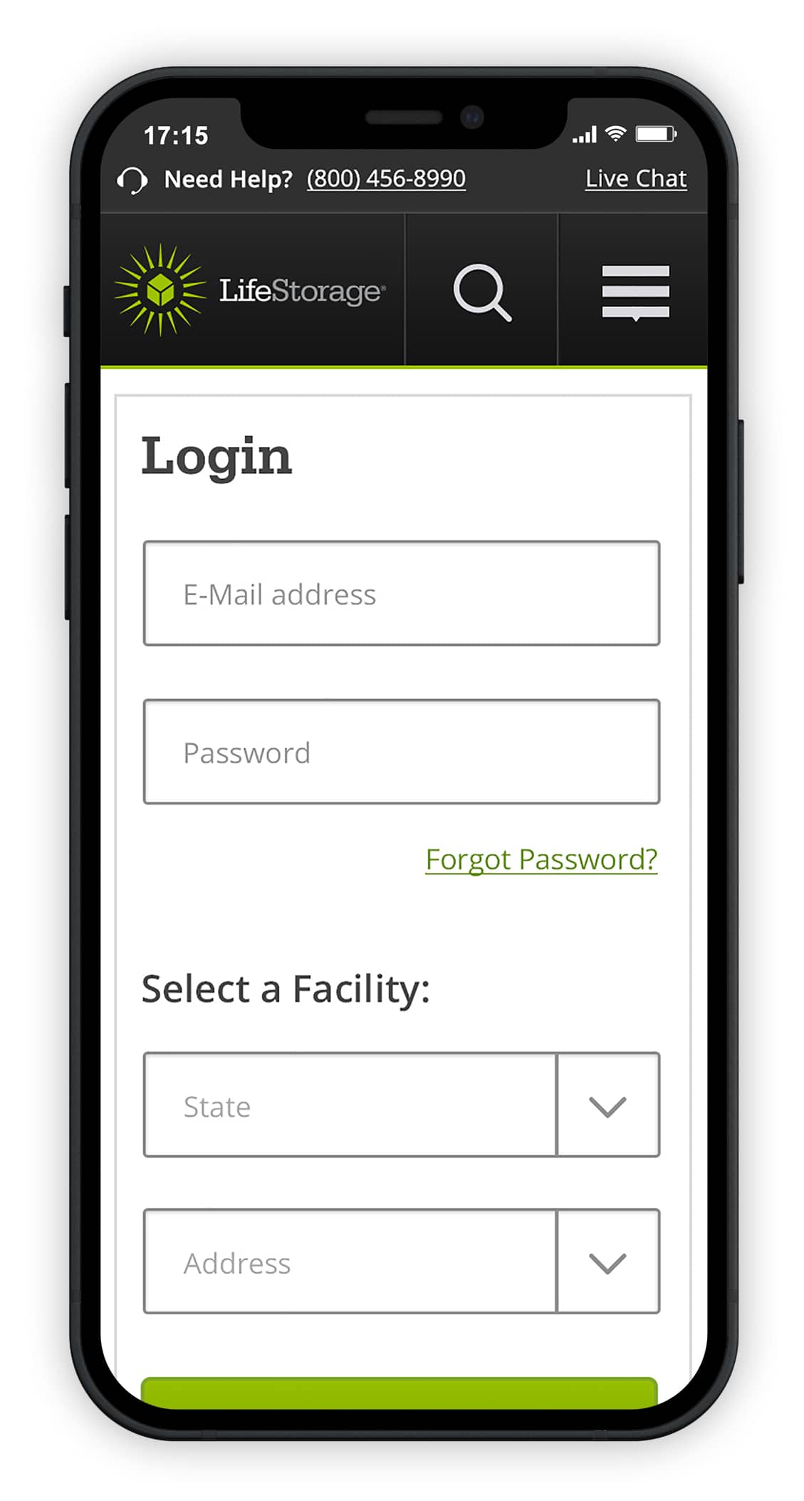
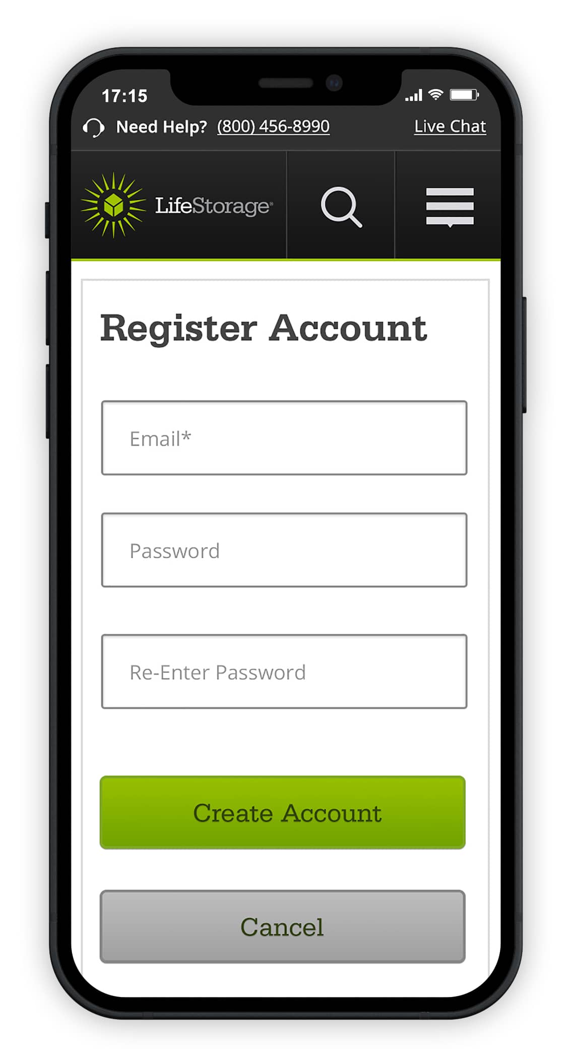
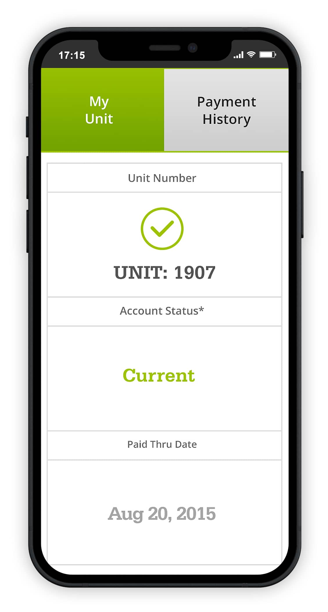
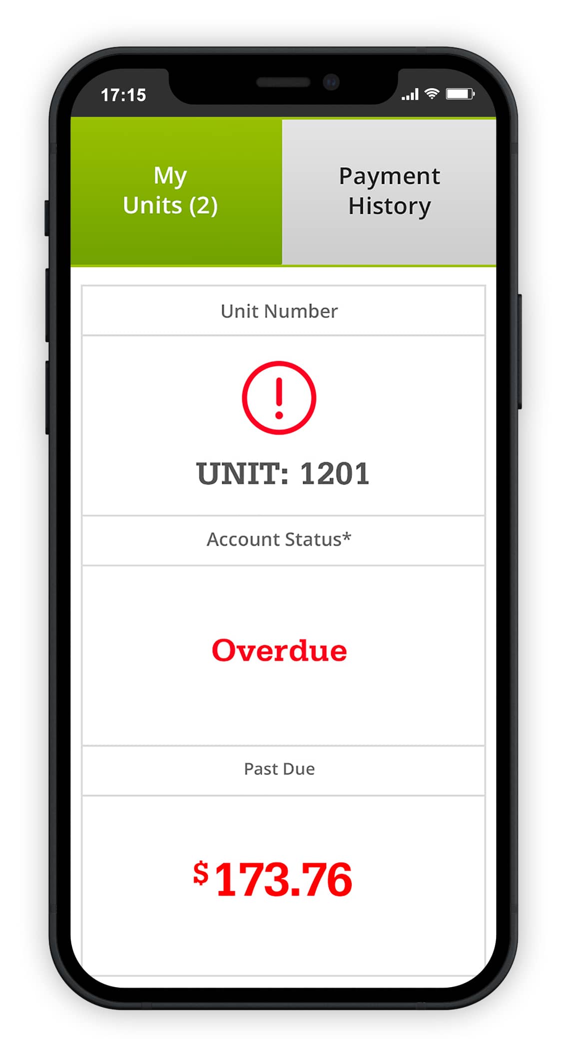
Building account portals, and keeping the visual appeal intact
An additional task that was given by the client, was to produce graphics that were consistent with the web site redesign. We wanted to be sure that the browsing experience, as well as the account experience were both consistent in their look and feel, as well as keeping in mind that the account portal area, was to feel more like a web application than a web browsing experience. We achieved this by creating larger button prompts as well as easy to read navigation across the experience.